
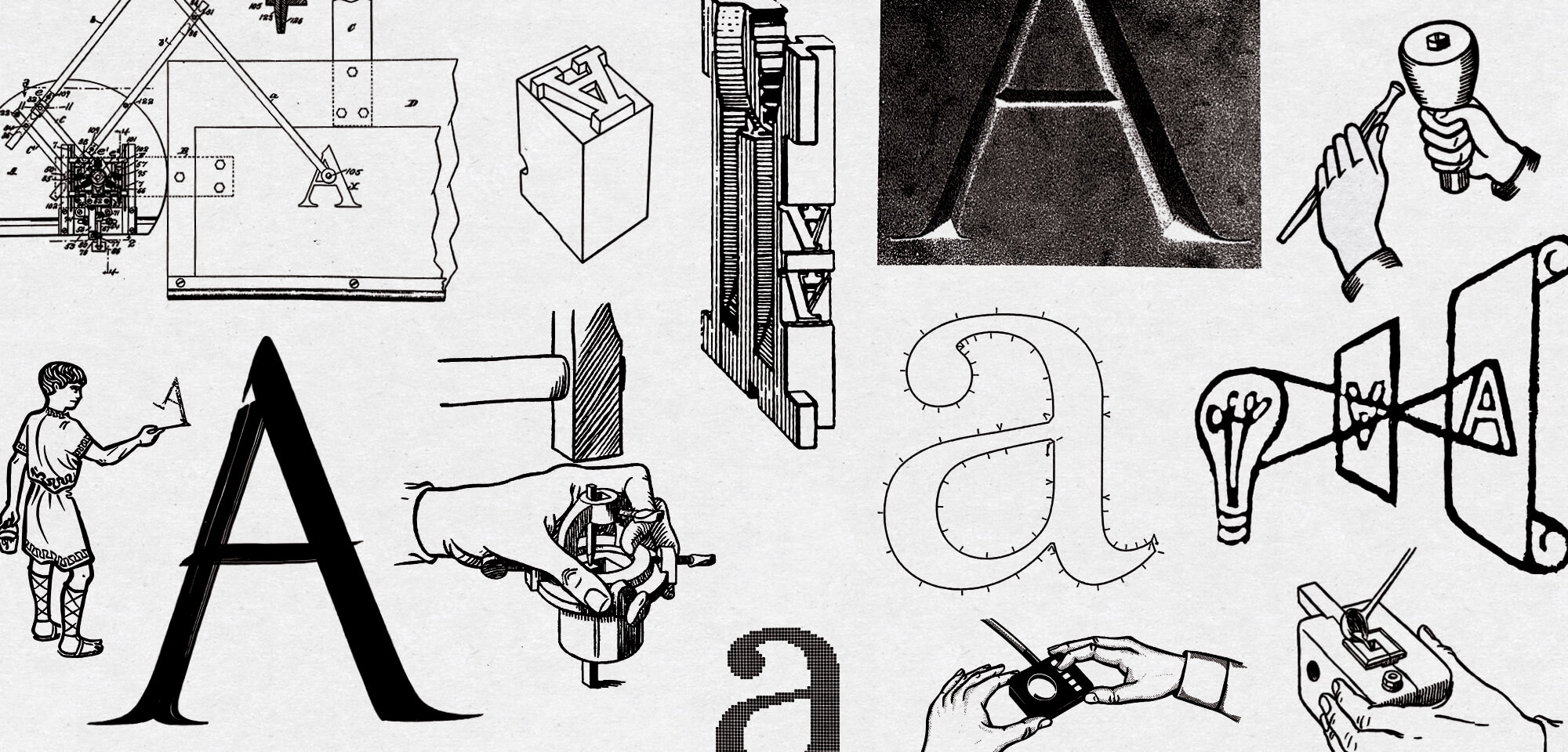
While the written word has been a constant since its advent, the technology used to create and display it has been in almost constant flux. What started as a slow evolution through stone and pen, exploded into moveable type; and has only increased in speed and innovation for the past 100 years. The lifespan of each technology grows shorter and shorter with every subsequent generation. Setting metal type by hand gives way to the Linotype and Monotype machines, which give way to photo type which gives way to Postscript and IKARUS, which become OpenType, which evolves into Variable Fonts, which gives way to… Well, where do we find ourselves now? This June—with AI getting more and more capable of replacing designers every new day—Spectacle, with support from Order Type Foundry, takes a moment to pause and look back at films highlighting typeface designers and lettering artists, the technologies of the past, and how they dealt (or didn’t deal) with the innovations of their time.
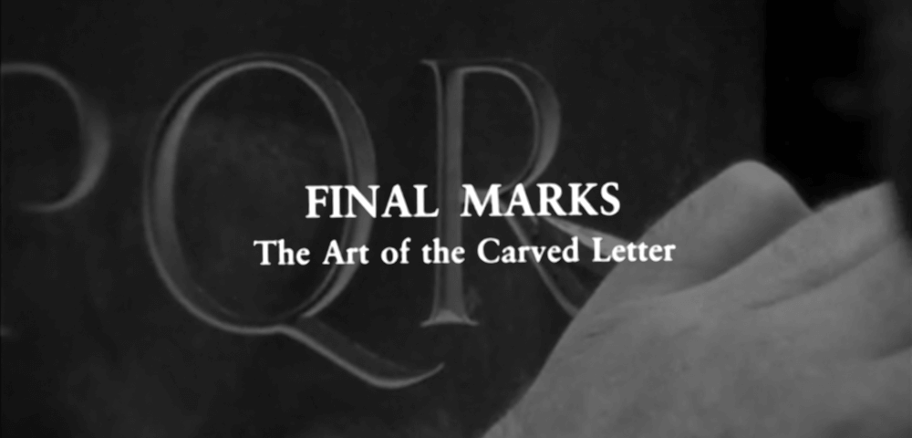
FINAL MARKS: THE ART OF THE CARVED LETTER
Dirs. Frank Muhly Jr. & Peter O’Neill, 1979
United States. 49 min
In English
TUESDAY, JUNE 6 – 7:30 PM [ Buy Tickets ]
THURSDAY, JUNE 15 – 7:30 PM with Filmmaker Q&A, this event is $10 [ Buy Tickets ]
THURSDAY, JUNE 22 – 10 PM [ Buy Tickets ]
FINAL MARKS documents the work of the John Stevens Shop in Newport, Rhode Island. Founded in 1705 by the eponymous English immigrant, the shop was run by his family for over 220 years until it was purchased by calligrapher John Howard Benson in the 1920s. It remains within the Benson family to this day. By the time the documentary was filmed in the late 1970’s, Benson’s son John Everett Benson, or “Fud”, ran the shop with his associates: John Hegnauer and Brooke Roberts; all of whom appear notably young and hip in bell-bottom jeans and sneakers. It should be noted that even by this point, carving letters into stone was already considered a dying art; replaced on graves and buildings by industrial techniques such as sandblasting, and pneumatic chisels.
The filmmakers were given complete access to the shop for over two years, allowing them to film intimate moments with the artisans in their day-to-day lives. As the subjects correspond with clients, source stone for the shop, and travel to Washington D.C. for an on-site commission adorning the then incomplete I.M. Pei extension of the National Gallery, directors Muhly and O’Neill take a subtle and restrained approach to capturing the shop’s endeavors; creating a film that is as meditative and contemplative as its subjects. The poised restraint of the camera’s movements is an equal match to the elegance of Benson’s lettering.
Fud Benson and Hegnauer act as the primary narrators of the film, musing about their motivations, beliefs, and ideologies as they relate to the practice and vocation of carving letters. For Benson and his team, cutting the stone is only a small part of the endeavor; designing the letterforms and their collective layout is the real challenge. Benson visits the Common Burial Ground in Newport, located just up the street from the shop, to investigate the stonework of those who came before him. He comments on his father’s early carving, his influences, and his abilities as a letterer and letter cutter; primarily focusing on how he used the ancient roman brush style to inform, and give personality to his stone cutting.
Screening with:
CONVERSATIONS WITH PAUL RAND
Dir. Preston McClanahan, 1997
United States. 26 min
In English
Director Preston McClanahan is joined by FINAL MARKS filmmaker Peter O’Neill—acting as cinematographer—to document this conversation with famed graphic designer Paul Rand. Shot on 16mm in the designer’s Weston, Connecticut home, the film finds Rand informally discussing such topics as design, art, modernism, and aesthetics. Rand is congenial but at times stiff and codgerly; old and set in his ways. O’Neill’s camera work is just as sharp as it was in FINAL MARKS, elevating this short film and Rand’s work. Fun fact: the film’s titles are co-credited to prolific type designer, and then student, Cyrus Highsmith.
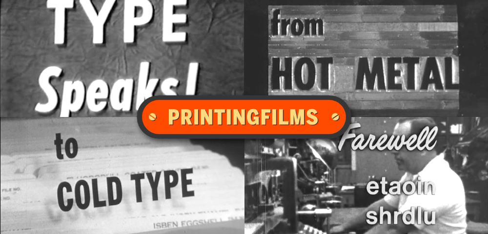
An Evening with Doug Wilson and the PRINTING FILMS Archive
A look at the methods of type creation through the ages and the growing pains of an industry and its workers as the technology changes generationally. With the specter of AI looming over today’s designers, it is interesting to look back at how working class and union typographers dealt with the transition of metal type to photographic processes. A selection of three films from the Printing Films Archive will showcase the historical methods of creating movable type (TYPE SPEAKS), how these methods were radically transformed in the 60s and 70s as new technology displaced the old (FROM HOT METAL TO COLD TYPE), and how workers and union members were affected by and dealt with this transition (FAREWELL ETAOIN SHRDLU).
Spectacle will be joined by Printing Films’s purveyor, Doug Wilson, who will be in attendance to commentate, give context to the films and answer audience questions. Doug Wilson is a writer, product designer and filmmaker based in Denver, Colorado. Wilson directed the 2012 feature-length documentary LINOTYPE: THE FILM which centers around the eponymous typecasting machine, its history, and its demise.
SUNDAY, JUNE 18 – 7:30 PM, One night only, this event is $10 [ Buy Tickets ]
Run of show:
1. TYPE SPEAKS
Dir. Unknown, American Type Founders Company, 1949
United States. 25 min
In English
Narrated by NBC radio personality Ben Grauer, this ATF-produced film is an in-depth and accessible showcase of how type is made from start to finish. From the design & pattern making, to the punch & matrices, to—ultimately—moveable type and the printed word. This film features Warren Chapell’s calligraphic sans serif typeface design, Lydian.
2. FROM HOT METAL TO COLD TYPE
Dir. Unknown, International Typographic Union, c. 1965
United States. 24 min
In English
Created by the International Typographic Union in the mid sixties to cajole union members into learning the new photographic methods of typesetting, this film begins with an explanation of the hot-metal process, then goes on to showcase the many photographic techniques used in setting type; from typesetting via paste-ups, to making plates, to developing negatives. The film follows each new process to the ultimate/inevitable printed conclusion.
3. FAREWELL ETAOIN SHRDLU
Dir. David Loeb Weiss, 1978
United States. 29 min
In English
Narrated by Carl Schlesinger, and named after the keyboard arrangement of the Linotype machine (Etaoin Shrdlu being the Qwerty of the pre-desktop computer age), this film documents the final day of hot metal typesetting within the composing room of the New York Times (Sunday, July 1st, 1978). The Linotype and Ludlow machines being used will be “by morning, relics of the past”. The film gives a detailed account of how a Linotype machine operates, its components, and how it is used by a trained compositor. Followed by the rest of the newspaper making process, including layout, proofing, mold making, and printing; all seen only minutes before deadline. One older staff member decides to make the night his last, retiring alongside the Linotype machine so as to avoid having to learn any of the new computerized photographic methods, which are detailed in the latter part of the film.
In a monologue at the end of the film, Schlesinger takes solace in the fact that, while these new computer processes have replaced what he once knew, there are still human hands, eyes, and minds behind them. If he only knew what was to come.
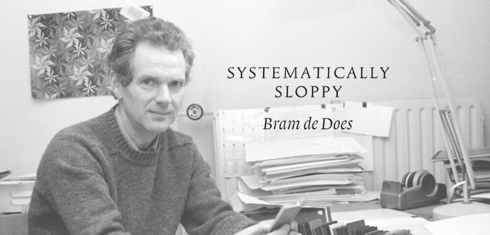
SYSTEMATICALLY SLOPPY: BRAM DE DOES, TYPE DESIGNER AND TYPOGRAPHER
(SYSTEMATISCH SLORDIG: BRAM DE DOES, LETTERONTWERPER EN TYPOGRAAF)
Dir. Coraline Korevaar, 2003
Netherlands. 53 min
In Dutch with English subtitles
WEDNESDAY, JUNE 7 – 7:30 PM [ cancelled due to weather ]
SUNDAY, JUNE 18 – 5 PM, featuring post-film discussion with Mathieu Lommen, Erik van Blokland, and Hannes Famira. This event is $10 [ Buy Tickets ]
SATURDAY, JUNE 24 – 3 PM [ Buy Tickets ]
Amongst type designers, at least according to the writer, Bram de Does is legendary. A perfectionist obsessed with precision, his legacy and influence far outpace his production—creating only two typefaces in his lifetime. The quality of his types are so highly regarded that he is considered one of the greatest to ever do it. S-tier. SYSTEMATICALLY SLOPPY stars a large cast of Bram’s colleagues and contemporaries, as well as the man himself, in a discussion of his career, his work, his nature, and the nature of work itself. The film features interviews with prominent members of the Dutch type design community, like the late Gerard Unger, both Gerrit and Peter Matthias Noordzij, Mathieu Lommen, a few Enschedés, Jost Hochuli, and more.
The documentary, like Bram, is direct and workmanlike, and features a soundtrack of Bram’s own violin playing. It details Brams early life and career before type design: as an aspiring musician, and a graphic & a book designer for the Joh. Enschedé printing and foundry operation, where he grew to detest life in middle management. The second act of the film tells the origins of Bram’s two masterful typeface designs, Trinité and Lexicon. For a man so good at something, between both book design and type design, it’s wonderfully comforting to listen to him describe how much he loathed it. How much he would rather enjoy life, play music, and farm the land, than have to deal with bosses and Work with a capital W. Bram is mindnumblingly and unfuckwithably talented, but still feels tied to the job, because of a need for income, and is just as alienated as the rest of us.
Spectacle will be joined virtually by Mathieu Lommen and Erik van Blokland for a discussion with Hannes Famira following the film on Sunday June 18th. Lommen is a design historian and a curator of Graphic Design at the Allard Pierson museum of the University of Amsterdam. In addition to appearing on screen in the film, he initiated and edited “Bram de Does: typographer & type designer” in 2003, the first substantial publication devoted to De Does’s life and work. Erik van Blokland is a Dutch type designer, tool developer, and educator. He is the head of the TypeMedia masters program at the Royal Academy of Art, in The Hague, and sells original typefaces through his own LettError studio as well as through foundries like House Industries and Commercial Type. Hannes Famira is a type designer and filmmaker. He is the lead instructor at the Type@Cooper program at Cooper Union, and releases typefaces under his own name through Type Network.
Screening with:
THE MAKING OF A RENAISSANCE BOOK
Pr. Dana Atchley, 1969
Belgium, United States. 21 min
In English
Shot entirely on location at the Plantin-Moretus Museum in Antwerp, this short film details the complete process of carving punches, striking and justifying matrices, casting type, and printing text, all of which is based on the writings of Christophe Plantin himself. Special thanks to Book Arts Press and the Rare Book School.
Series sponsored by:
![]()